On store shelves and online, you have seconds to capture a buyer’s attention to get them to notice your spirit bottle, pick it up, and ultimately purchase. In a market full of spirit options—both in stores and online—how do you make your spirits label stand out?
Consumers, especially millennials, make a lot of their purchasing decisions based on the label. We’re not supposed to judge a book by its cover, but as humans, we do.
Here are our tips for making sure your spirits label stands out.
1. Use Color Intelligently
You don’t have to have a rainbow of colors on your label to stand out. On the contrary, dark, seductive designs can capture as much attention as bright, flamboyant looks.
The blend of colors on your label, as well as the bottle color and shape, have to be as well-thought-out as the contents of the bottle. Everything works together to create a visual experience that serves as the first attention-grabbing step in the buying journey.
Surf City used bright, vibrant artwork—printed on double-sided labels—to turn their bottles into a collect-them-all keepsake. Read more about these labels in our Brand Spotlight.

On the other hand, this Slow Hand label uses muted colors on white to show off its clear white whiskey.

2. Get Tactile so Customers Can “Feel” Your Spirits
Spirits aren’t just about taste and sight, they’re also about touch. Give consumers a full sensory experience with textures and tactile varnishes that will make your bottle irresistible.
With our wide range of finishing capabilities, you can customize the feeling of your label to the tiniest detail. Add embossing, stamping, varnish, or more to get the buyer’s senses involved in the experience.
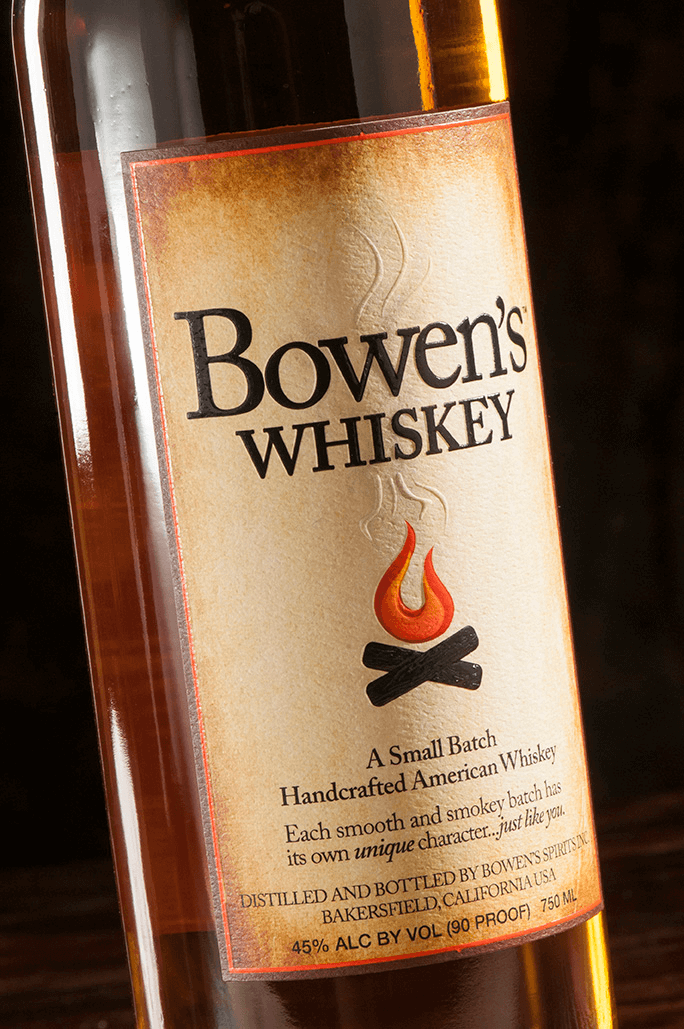
Bowen’s Whiskey adds a touch of texture with a subtle texture background and embossed elements on the campfire.
3. Opt for Die Cuts
Your bottles don’t have to conform to boring shapes; neither do your labels. Go out-of-the-box with unique label shapes for your spirits. Choose from standard shapes, or go custom to align with your brand.
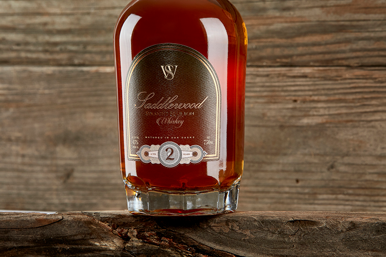
Sandalwood used a unique die cut that matches the details of the bottle. This label also includes a patterned texture background and gold finish to give this Bourbon a one-of-a-kind look and feel.
4. Stay On Brand
You’ve heard the importance of branding your distillery and your spirits. Your customers should be able to immediately pick out your bottle from a crowd (or a dark shelf behind the bar). To make that happen, your label needs to integrate consistent brand elements and use small details to share your brand story.
For example, if part of your brand is being green/eco-friendly, you can use recycled paper. If your brand is goofy and off-the-wall, you can use colors and textures to show that personality. If you’re more serious, you can show that with dark colors, gold finishes, and clean fonts.
The Jesse James brand uses consistent label die cuts, fonts, and graphic elements on their family of labels, so when you see one, there’s no question what brand it is.

5. Partner With a Spirits Label Expert
You’re the spirits experts, we’re the label experts. There are endless options for making your label stand out. You’ll get the best results if you partner with a designer and a spirits label printer that knows the challenges and needs of the industry.
When you work with AWT, you get more than a label printer. You get a partner. We help brainstorm and create labels that tell your story and catch eyes on the shelf (or the screen). We love working with distilleries in the early stages of label design to build a work of art worthy of your concoction.
Do you want to make your spirits label stand out? Talk with one of our spirits label experts to brainstorm how to bring your vision to life.


